Quick Answer: Gold jewelry pairs with every outfit color — the trick is knowing when to let it blend and when to let it contrast. Warm gold against cool navy creates tension. Delicate gold chains against stark black create architecture. Gold against white creates luminosity. Master the color-wheel dialogue between metal and fabric, and your jewelry will never feel like an afterthought.
- Gold Jewelry with Neutrals — Black, White, Beige & Grey
- Gold Jewelry with Jewel Tones — Navy, Emerald, Burgundy & Plum
- Gold Jewelry with Pastels — Pink, Lavender, Mint & Sky Blue
- Gold Jewelry with Bold Colors — Red, Orange, Yellow & Cobalt
- Gold Jewelry with Earth Tones — Brown, Olive, Terracotta & Rust
- Gold Jewelry with Prints & Patterns
- When to Mix Gold with Other Metals
- The ÉLARAMUSE Standard
- Editor's Picks
- FAQ
Gold Jewelry with Neutrals — Black, White, Beige & Grey
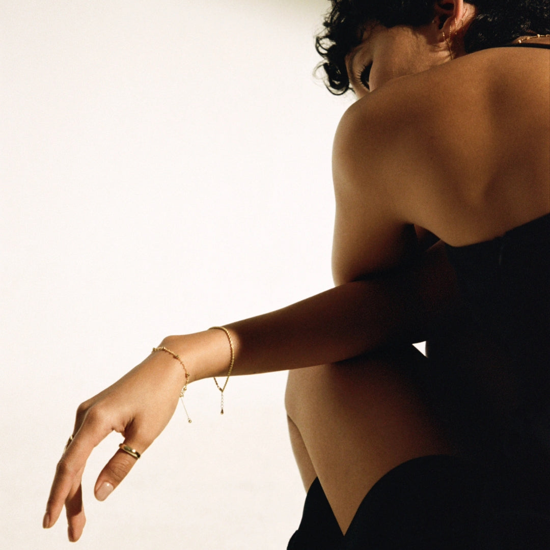
Neutral outfits are the blank canvas of styling — and gold jewelry is the brushstroke that turns a canvas into a composition. Against black, gold reads as deliberate and architectural. The high contrast between warm metal and deep darkness creates the strongest visual statement of any color pairing. A gold dome ring or sculptural cuff against an all-black outfit is not accessorizing — it is punctuating.
Against white, gold becomes luminous — softer, more romantic, almost liquid. This is where delicate chains, pavé details, and layered necklaces shine. The light bounces off the white fabric and nestles into the gold, making even minimalist pieces feel substantial.
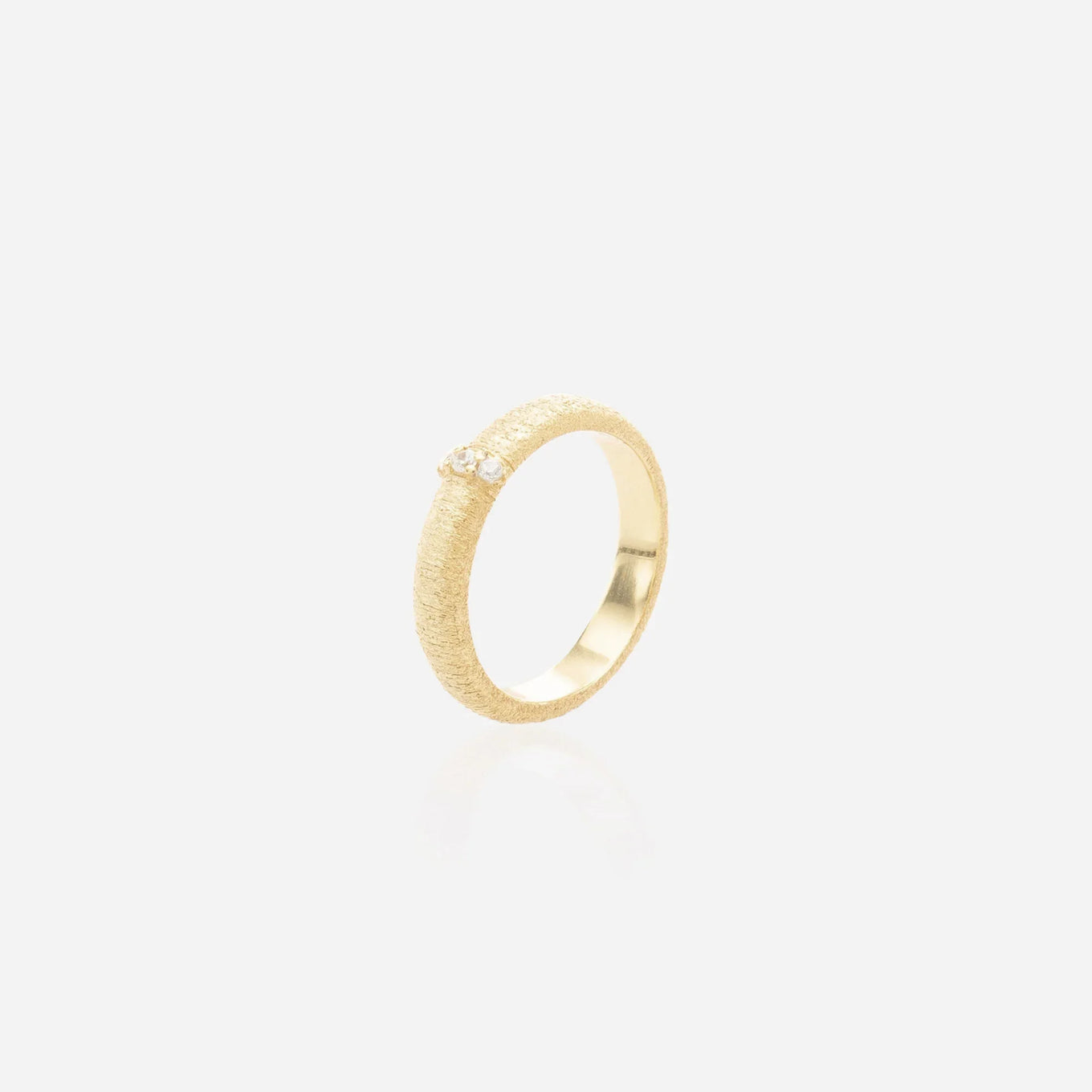
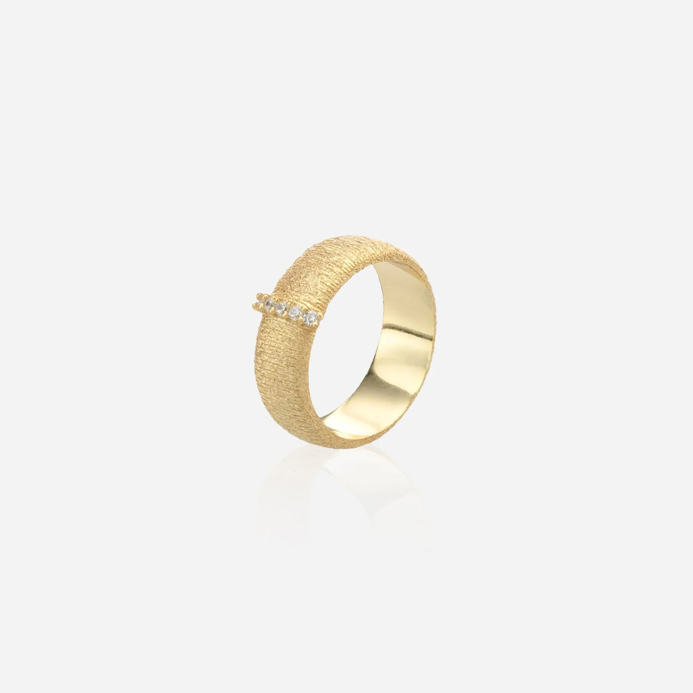
Beige and cream are trickier: gold can disappear into these tones if the pieces are too small. The solution is not bigger jewelry — it is textured jewelry. A hammered gold bangle, a ridged band ring, or a coin pendant with surface detail creates the visual friction that keeps gold from vanishing into neutral warmth.
Grey — the most underrated gold partner — creates a sophistication gradient that reads as effortlessly expensive. Light grey with soft gold chains feels like a Parisian morning. Charcoal grey with bold gold cuffs feels like a gallery opening. The pairing works because grey is emotionally neutral while gold brings warmth — balance achieved without any effort from you.
Gold + Neutral Pairing Guide:| Neutral | Best Gold Pieces | Why It Works |
|---|---|---|
| Black | Statement rings, architectural cuffs, bold chain necklaces | Maximum contrast = maximum impact |
| White | Delicate chains, pavé details, layered pendants | Luminosity amplifies gold's warmth |
| Beige/Cream | Textured bangles, coin pendants, ridged bands | Surface interest prevents visual blending |
| Grey | Chain bracelets, pearl-accent gold, sculptural earrings | Cool warmth = understated luxury |
Gold Jewelry with Jewel Tones — Navy, Emerald, Burgundy & Plum
Jewel tones are gold's natural habitat. The deep saturation of a navy blouse or an emerald dress creates exactly the kind of rich backdrop where gold looks its most expensive. This is not color theory — it is physics. Deep, cool wavelengths recede while warm metallics advance, and the result is a visual push-pull that makes both the fabric and the jewelry look better than they would alone.
Navy + gold is the most reliable pairing in fashion. A crisp navy blazer with a layered gold chain necklace has been a uniform of taste for decades — and it has not aged a day. Emerald green + gold is the richest pairing on the spectrum, the combination jewelers have been exploiting since the Renaissance. Burgundy + gold reads as romantic and deliberate — this is the dinner-date combination. Deep plum + gold is moodier, more editorial, the pairing for someone who wants to look interesting before she looks conventionally pretty.
Gold + Jewel Tone Pairing Guide:| Jewel Tone | Best Gold Pieces | Vibe |
|---|---|---|
| Navy | Chain necklaces, hoop earrings, tennis bracelets | Classic, authoritative, polished |
| Emerald | Cocktail rings, statement pendants, gold drop earrings | Rich, opulent, unforgettable |
| Burgundy | Heart pendants, bow motifs, ruby-accent pieces | Romantic, intentional, warm |
| Plum | Sculptural earrings, wide bands, Byzantine-inspired gold | Moody, editorial, unexpected |
Gold Jewelry with Pastels — Pink, Lavender, Mint & Sky Blue
Pastels soften everything they touch — including gold. Where jewel tones amplify gold's richness, pastels diffuse it into something gentler. A lavender dress with a gold clover pendant does not read as "statement jewelry." It reads as a woman who does not need to make statements — because she knows exactly who she is.
The risk with pastels is disappearing. Soft colors can swallow lightweight jewelry whole, leaving the overall look washed-out. The fix is simple: choose gold pieces with structural definition. An open cuff ring holds its shape against a blush-pink outfit. A textured chain necklace — not a smooth cable chain, but one with marquise links or an articulated surface — maintains visual presence against mint or sky blue.
Pink and gold is the most popular pastel pairing, and for good reason: the warmth overlap between blush pink and 18K gold creates a seamless tonal transition. Unlike lavender-gold (cool-warm contrast), pink-gold feels like two adjacent notes in the same chord. If you only own one pastel outfit, make it pink — and wear all the gold with it.
Gold Jewelry with Bold Colors — Red, Orange, Yellow & Cobalt
Bold colors demand bold decisions. A fire-engine red dress with timid gold studs looks like you got scared halfway through getting dressed. But that same dress with a wide-band gold ring and layered chain bracelets? That looks like someone who planned this.
Red and gold is the power pairing — worn by royalty for millennia, and still the single most commanding color-metal combination in existence. Gold against cobalt blue creates an electric contrast that feels futuristic and deliberate. Orange and gold is unexpected — most people avoid it — but in the right proportion (coral-orange top, heavy gold necklace), it reads as daring in the best way. Yellow and gold is the hardest to pull off: two warm tones competing for attention. The solution is to separate them with skin — a lower neckline that creates a gap between fabric and metal.
The Rule for Bold Colors: When the fabric is loud, the jewelry needs to be substantial — not necessarily large, but visually weighty enough to hold its ground. A tiny chain gets lost against cobalt. A wide-band ring does not.Gold Jewelry with Earth Tones — Brown, Olive, Terracotta & Rust
Earth tones and gold share a color family, which makes this the most harmonious pairing category — and also the riskiest, because harmony can tip into monotony. The key is texture: matte gold against a linen-brown shirt, polished gold against a terracotta dress, brushed gold against olive silk. Each finish creates a different relationship with the same earth-tone base.
Olive green and gold is the underrated hero combination of earth-tone styling. Olive is cool-leaning enough to create contrast with warm gold, but earthy enough to feel cohesive rather than clashy. It is the pairing you want for brunch, for travel, for anywhere you want to look put-together without looking like you tried.
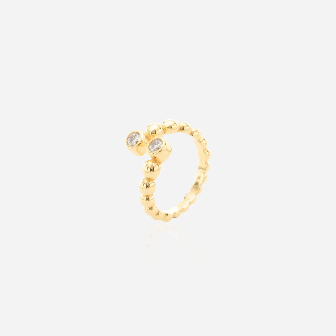
Terracotta and gold — two warm tones meeting — is the highest-risk earth-tone combination because the likeness can flatten both colors. The solution: gold pieces with negative space. A bypass ring or open cuff creates a gap between the warmth of the fabric and the warmth of the metal, keeping both distinct.
Gold Jewelry with Prints & Patterns
Prints complicate the color matching equation because they contain multiple colors competing for visual attention. The rule is deceptively simple: gold jewelry should echo the print's dominant color temperature, not its specific hues. A floral dress with cool blues and greens as the background calls for understated gold — thin chains and small hoops that do not fight the pattern. The same dress with pink and peach florals instead invites bolder gold — the warmth alignment creates cohesion.
For stripes and geometric prints, architectural gold pieces work beautifully: angular earrings, geometric pendants, pieces with clean lines that mirror the pattern's structure. For animal prints — leopard, snakeskin — gold is the universal partner because the warmth of animal patterns lives in the same color-temperature neighborhood as 18K gold.
When to Mix Gold with Other Metals
Once you have mastered gold-with-color pairings, the next level is metal mixing — wearing gold alongside silver, rose gold, or gunmetal. The old rule ("do not mix metals") died years ago, but the new rule is subtler: mix with intention, not neglect.
Gold + silver works when one metal dominates (80% gold, 20% silver) and the pieces are in different zones — gold necklace, silver ring. Gold + rose gold is the easiest mix because the pink undertone of rose gold lives next to yellow gold on the spectrum. Gold + gunmetal creates a deliberately edgy contrast — this is the pairing for black outfits and moody evenings.
The best way to start mixing metals, if you have never done it, is with a single two-tone piece — a bicolor choker or a gold ring with silver accents. Let the piece do the mixing for you, and build confidence from there.
The ÉLARAMUSE Standard
| Feature | Specification |
|---|---|
| Base Metal | Solid Ag925 Sterling Silver |
| Plating | 0.5-micron 18K Gold Plating |
| Safety | 100% Nickel-Free, Hypoallergenic |
| Durability | Water-resistant, Tarnish-resistant |
| Stones | High-Carbon Lab Diamonds (Simulated) & Nano Zircon (Lab-grown) |
Editor's Picks: Gold for Every Outfit Color
- For Black Outfits — Solaris Dome Ring: The architectural sunburst that anchors an all-black look with maximum contrast.
- For Navy — Box Chain Necklace: The layering foundation for every navy blazer you own.
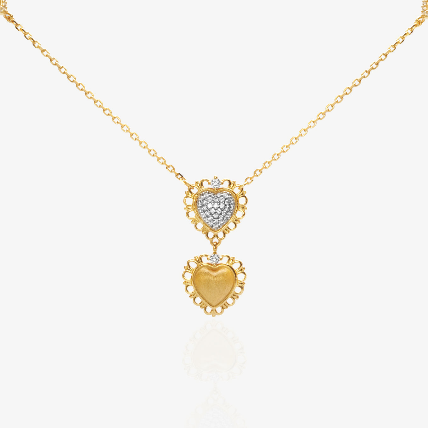
- For White — Bijou Heart Necklace: Delicate gold pendant luminous against white fabric.
- For Jewel Tones — Crossover Ring: Lab-diamond band that holds its own against deep emerald or burgundy.
- For Prints — Bypass Ring: Open design that does not compete with patterns — it complements them.
FAQ
Does gold jewelry go with every outfit color?
Yes — but with different intentions. Gold against black creates bold contrast. Gold against white creates luminosity. Gold against navy creates timeless polish. The only combination that requires care is gold against warm yellows, where the similarity can flatten both. For details, see our section on bold color pairings above.
What jewelry goes with a black dress?
Gold is the answer — and the bigger the statement piece, the better the result. A black dress absorbs color, so gold jewelry needs enough visual weight to register. A sculptural bracelet, a statement ring, or layered gold chains all outperform small, delicate pieces against black. (For more, read: Vogue's guide to accessorizing black)
Can you wear gold jewelry with silver clothing?
Metallic clothing — silver lamé, shiny grey satin — can create competition with gold jewelry. The solution: matte or brushed-finish gold pieces that read as "texture" rather than "another metallic." Or use a two-tone piece — like a bicolor choker — that bridges both metals in one design.
What gold finish works best with pastel colors?
Polished (shiny) gold works beautifully with pastels because the reflectivity adds dimension to soft, light-absorbing colors. Matte or brushed gold can look dull against pastels unless the jewelry has significant structural detail — an open cuff or a textured surface.
How does outfit color matching compare to skin tone matching for gold jewelry?
Skin tone matching is about whether the gold flatters you. Outfit color matching is about whether the gold flatters your clothes. The ideal: find pieces that satisfy both. If you are cool-toned and wearing a navy dress, a textured gold chain necklace satisfies both criteria — gold warmth complements the navy while the specific gold tone (18K, which carries a slightly cooler, paler yellow than 24K) works with your skin. If you are unsure about your skin tone, refer to our Jewelry for Your Skin Tone guide.
Behind the Design: A Founder's Note
Color matching sounds like a fashion editor's game — something for stylists and magazine spreads. But I have learned over years of watching women wear ÉLARAMUSE that it is actually instinctive. The woman who reaches for a dome ring when she wears black? She is not calculating contrast ratios. She is responding to something her eye already knows: that gold needs darkness to glow.
The colors you wear, the jewelry you choose, the way the two speak to each other — it is not about rules. It is about paying attention. And the women who pay attention are the ones whose style everyone else ends up trying to copy. Be your own color muse. — Joyce, Founder
Further Reading: GIA Gem History & Lore • The Met Museum Jewelry Collection